ARTICLES
Bar vs. Column Charts: Choosing the Right Chart for Effective Data Visualization
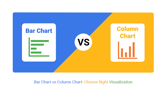
Bar charts and column charts are both effective for visualizing categorical data, but the choice between them depends on the nature of your data and what you want to emphasize.
When to Use a Bar Chart (Horizontal Bars):1. Bar charts are ideal when the category labels are long because horizontal text is easier to read.
2. If you have numerous categories, bar charts prevent overcrowding and keep the visualization clean. Personally, when I’m comparing more than 5 categories, I use bar charts.
3. Use bar charts for ordinal data (e.g., survey ratings) where trends over time aren't a focus.
4. If your dashboard or report has limited vertical space, a bar chart fits better horizontally.
When to Use a Column Chart (Vertical Bars):1. Column charts are better for showing trends over time, as we naturally associate left-to-right movement with progression.
2. Use column charts when you have fewer categories, as they require less horizontal space.
3. Column charts are often perceived as more intuitive when comparing magnitudes because taller columns align with our instinctive understanding of "higher is more."
4. Column charts fit better when paired with other vertical elements (e.g., line charts, stacked columns).
Slice It or Scrap It: Why Pie Charts Are the Junk Food of Data Visualization
Pie charts are often the subject of debate in the data visualization community, with many experts advising beginners to avoid them. While this advice is frequently repeated, it is not always accompanied by clear reasoning, leaving beginners puzzled about why beautiful pie charts are frowned upon. Well, I have decided to share the major reasons today.
1. Human perception struggles to accurately compare angles and areas, making it hard to differentiate between similar-sized slices of a pie chart.
2. Pie charts work best when there are only a few categories. Adding more slices can make the chart cluttered and confusing.
3. Pie charts take up a lot of space relative to the amount of information they convey, which can be a drawback in dashboards where more space is required.
4. Pie charts lack a natural order for their slices, unlike bar charts, where categories can be arranged by value or alphabetically for better comparison.
5. Pie charts focus on proportions, which may not be the most important aspect of the data. Other chart types, like bar charts, can display both absolute and relative values more effectively.
6. Small slices can become nearly invisible or hard to distinguish, leading to misinterpretation or loss of data clarity.
Did you know how NULL values are treated in GROUP BY?

In SQL, when you use GROUP BY, all NULL values in a column are grouped together, as if they were one single value. This can be surprising because, outside of GROUP BY, SQL treats NULL as an unknown, meaning that NULL = NULL is false!
Here's an example:
SELECT department, COUNT(*)
FROM employees
GROUPBY department;
If some department values are NULL, SQL groups all those NULL entries together. This is helpful for aggregation, but it can also lead to unexpected results if you're not aware of it. This behavior is unique to GROUP BY and highlights SQL’s different handling of NULL depending on context. So next time you’re aggregating, don’t forget to consider those NULLs!.
Cyclistic Bike Ride Article
The work reported in this study explores and discuss extensively on a public dataset gotten from Divvy Tripdata. The study was preceded by an elaborate and up-to-date analysis using the R programming language.